Anna Kate LeRoy
AKL_Squarespace_(Portfolio)_(UP)_(Proof_1)_20.jpg

UP

UP, or “University Programming” unified several existing student-run programs under one central identity, necessitating a comprehensive brand package that could be implemented on numerous print and digital platforms on a regular basis.

Brand Identity: logo design / style guide / brand collateral
AKL_Squarespace_(Portfolio)_(UP)_(Proof_1)_202.jpg
AKL_Squarespace_(Portfolio)_(UP)_(Proof_1)_203.jpg
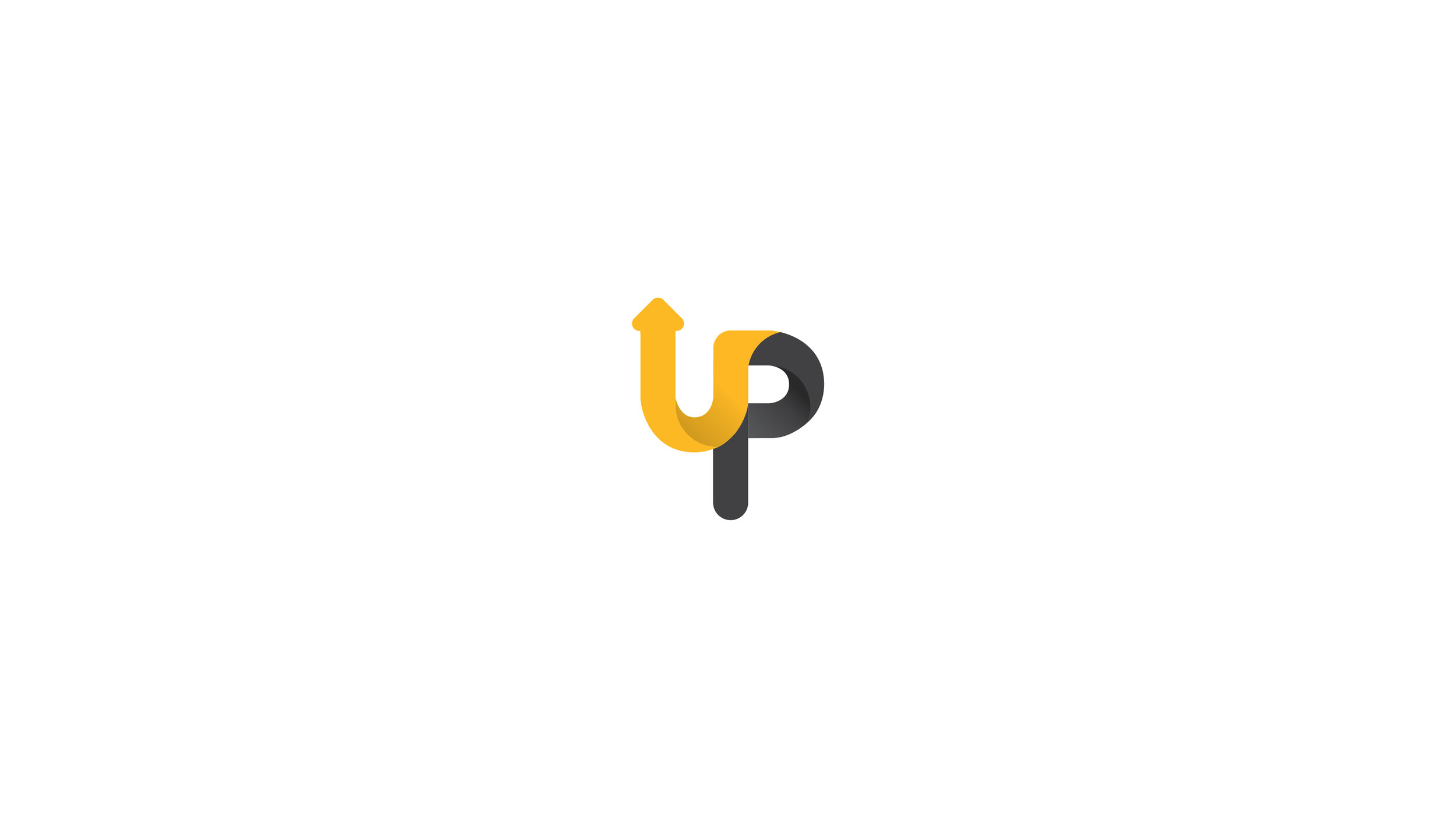
 The combination of the “U” and “P” along with the upward directional movement of the arrow in the logomark create a subliminal message to stir up a sense of motivation, aimed at getting students involved and engaged.
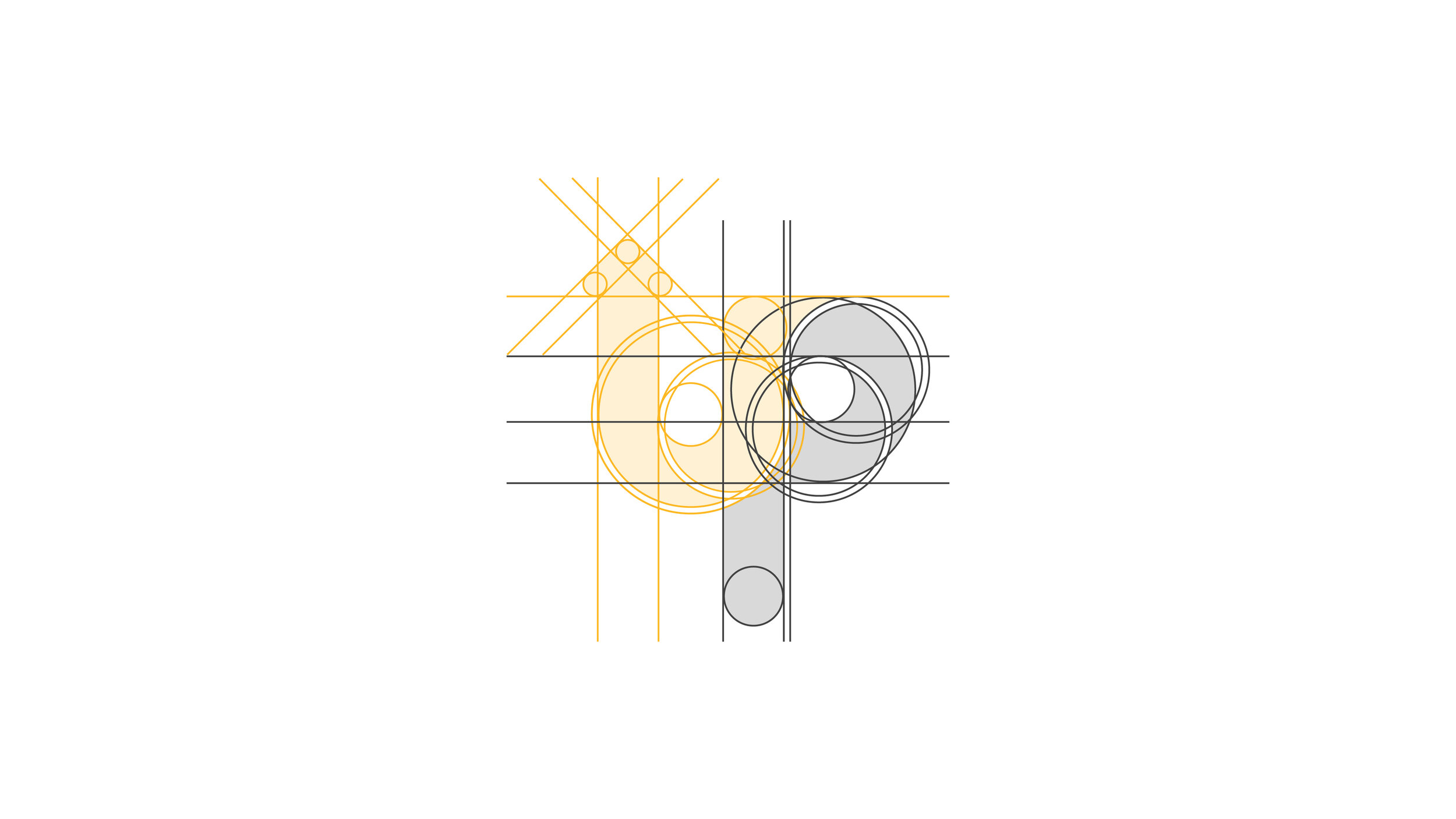
The combination of the “U” and “P” along with the upward directional movement of the arrow in the logomark create a subliminal message to stir up a sense of motivation, aimed at getting students involved and engaged.

AKL_Squarespace_(Portfolio)_(UP)_(Proof_1)_205.jpg
AKL_Squarespace_(Portfolio)_(UP)_(Proof_1)_206.jpg
AKL_Squarespace_(Portfolio)_(UP)_(Proof_1)_207.jpg
AKL_Squarespace_(Portfolio)_(UP)_(Proof_1)_208.jpg
 The “UP” logomark was able to be utilized for lighthearted puns on branded collateral.
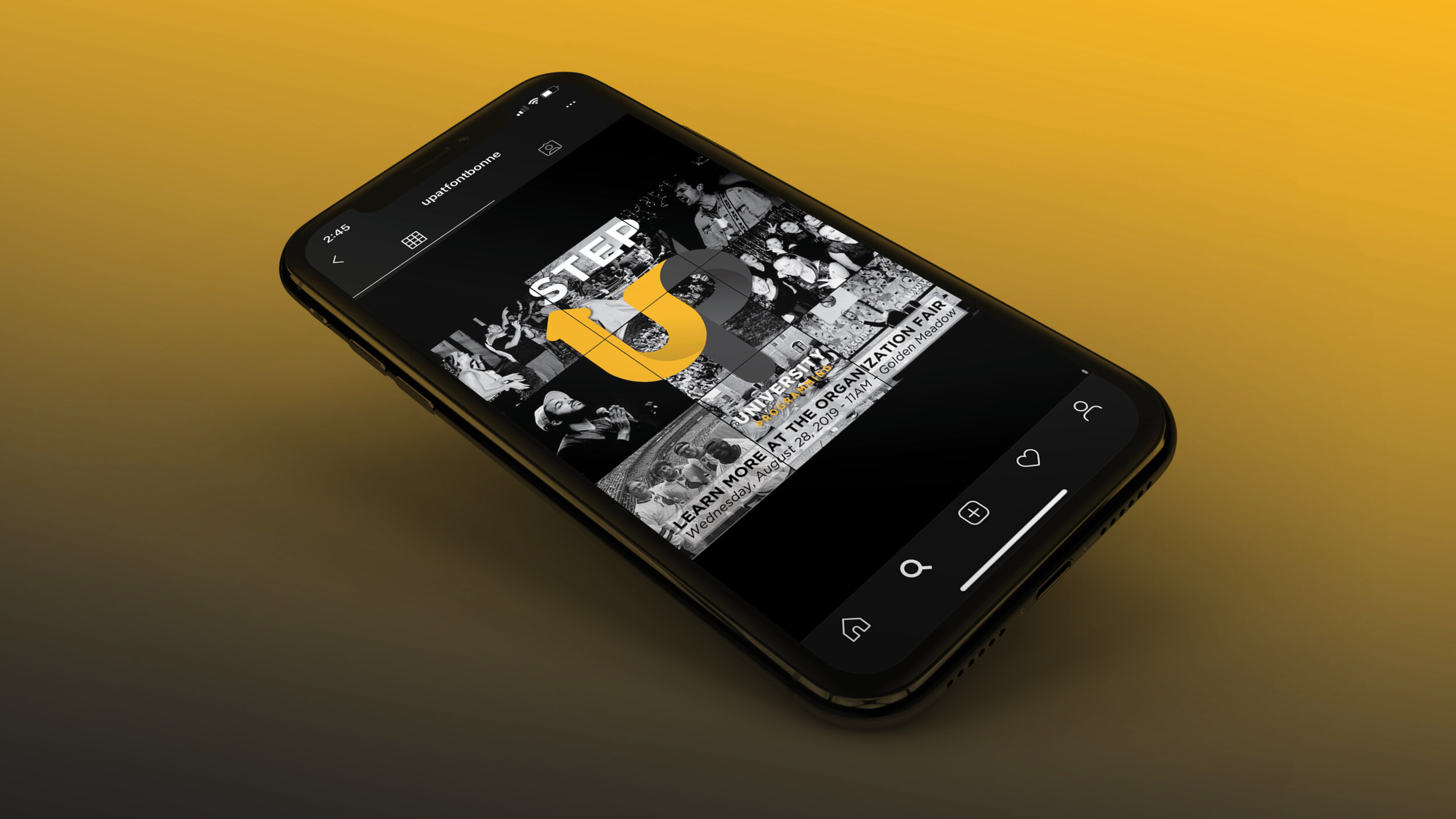
The “UP” logomark was able to be utilized for lighthearted puns on branded collateral.

AKL_Squarespace_(Portfolio)_(UP)_(Proof_1)_2010.jpg
Alternate unchosen logo direction:

Alternate unchosen logo direction:

AKL_Squarespace_(Portfolio)_(UP)_(Proof_1)_2012.jpg
AKL_Squarespace_(Portfolio)_(UP)_(Proof_1)_2013.jpg